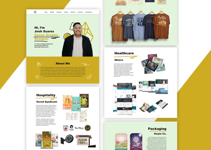
One standout project in my portfolio is a responsive website I designed entirely in Figma, which not only serves as a case study in UI/UX design but also functions as a platform to showcase my work in a more dynamic, interactive format. Rather than relying solely on static PDFs or traditional slideshows, I used Figma to transform selected portfolio pieces into a web-based experience—complete with responsive layouts for desktop, tablet, and mobile. This allowed me to present my work as users would actually experience it, adapting each design to feel natural on the platform it’s viewed from.


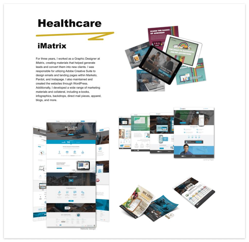
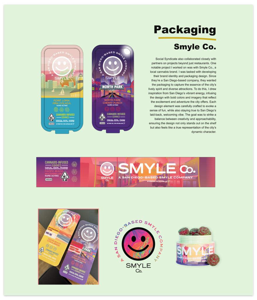

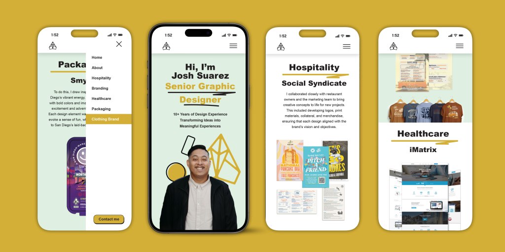
Using Figma’s tools like Auto Layout, Components, and Variants, I built a design system that kept everything consistent while letting me iterate quickly across breakpoints. I also created interactive prototypes to simulate live website behavior, making it easier to demonstrate user flows and design intent. This project not only highlights my technical skills in responsive design and systems thinking, but also shows how I can reimagine and present content in ways that elevate storytelling across formats. It’s a great example of how I use design tools strategically to bridge creativity and usability. I’ve included a video walkthrough to show how the website looks and feels in action, and you can also click the button below to explore the interactive prototype for yourself.
 Joshua Suarez